01 — beginning
From a logo to a festival
When Alpha first arrived on my desk, it wasn't a festival yet. It wasn't even entirely clear what it was going to become.
During my time at RedCloud, Noizy, one of Albania's most prominent artists, was preparing to organize a concert of his own. Many elements were still undefined — the scale, the final lineup, the architecture of the show itself — but there was one thing that already existed with certainty: the name was Alpha.
Several agencies involved in the project began exploring what this new event could look like and how it could communicate, searching for the image that would eventually appear on screens, posters and social feeds before anyone had stepped inside the venue. RedCloud entered that creative process as well, and I was given something particularly valuable: the freedom to propose my own interpretation.
So I started with the smallest possible element of what would eventually become a very large project.

A logo. But a logo alone wasn’t enough.
If Alpha was supposed to announce something new, I didn't want its identity to feel like another concert poster assembled around an existing photograph of an artist, a date and a few sponsor logos. Noizy already had photographs circulating through concerts, appearances, clubs and social media; using another one would promote the artist, but it wouldn't necessarily create a world for the event.
I wanted Alpha to have a world of its own.
02 — the world

Creating the world of Alpha
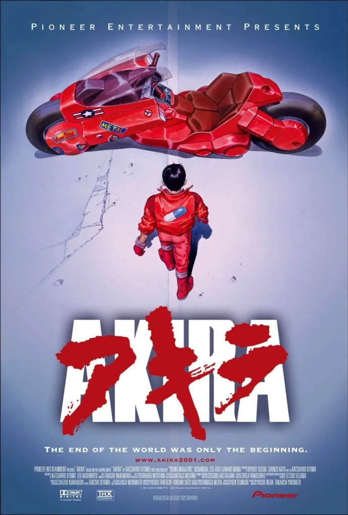
The visual direction began to form around a powerful red neon palette, deep shadows, hard contrasts and an atmosphere influenced by the visual intensity of Akira — not as an imitation of its imagery, but through the sensation it creates: electricity, scale, urban tension and the feeling that something enormous is about to happen.
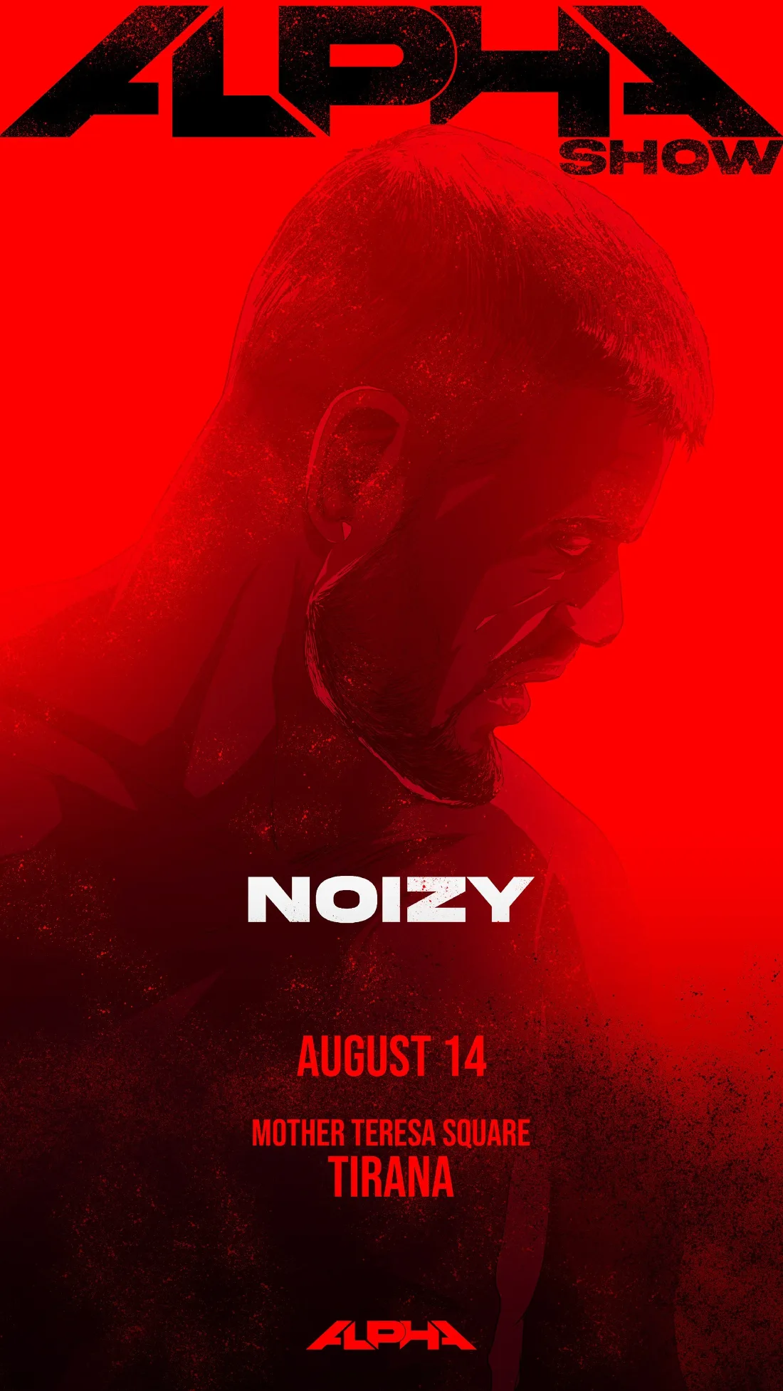
At the centre of the first artwork was Noizy. Instead of treating his photograph as the final asset, I used his image as the starting point for an original illustrated interpretation: his portrait emerging from darkness, severe and almost monumental, caught in counterlight while an aggressive red neon glow cut through the composition. Against it sat the newly designed Alpha logo.
The red wasn’t there simply to decorate the poster. It became its pulse.
The image had to work almost like a warning light in the city — something that could be recognized before it was properly read, something capable of stopping a thumb scrolling through a feed or holding its presence when enlarged across an outdoor surface.
The proposal was well received by the organizers. And what happened next changed the scale of the entire project.
03 — scale
One poster became three. Three became thirty.
Following the first artwork, Universal Music asked whether the same treatment could be developed for some of the international artists joining Noizy. The first experiments were Ghali and Loredana.
The idea was simple in principle but much more demanding in execution: every artist needed to retain their personality while appearing to inhabit the same universe. They couldn't become thirty variations of the same portrait, but neither could they look like thirty unrelated campaigns accidentally placed beside one another.
Each artist needed their own face. Alpha needed to remain the voice.
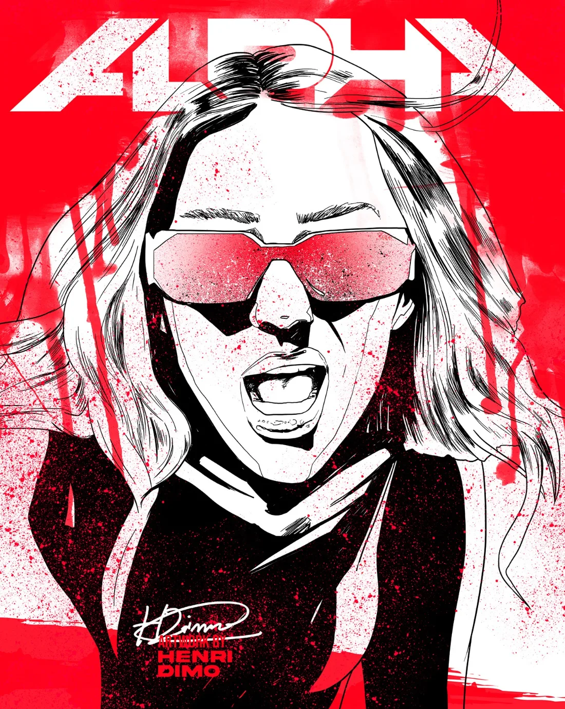


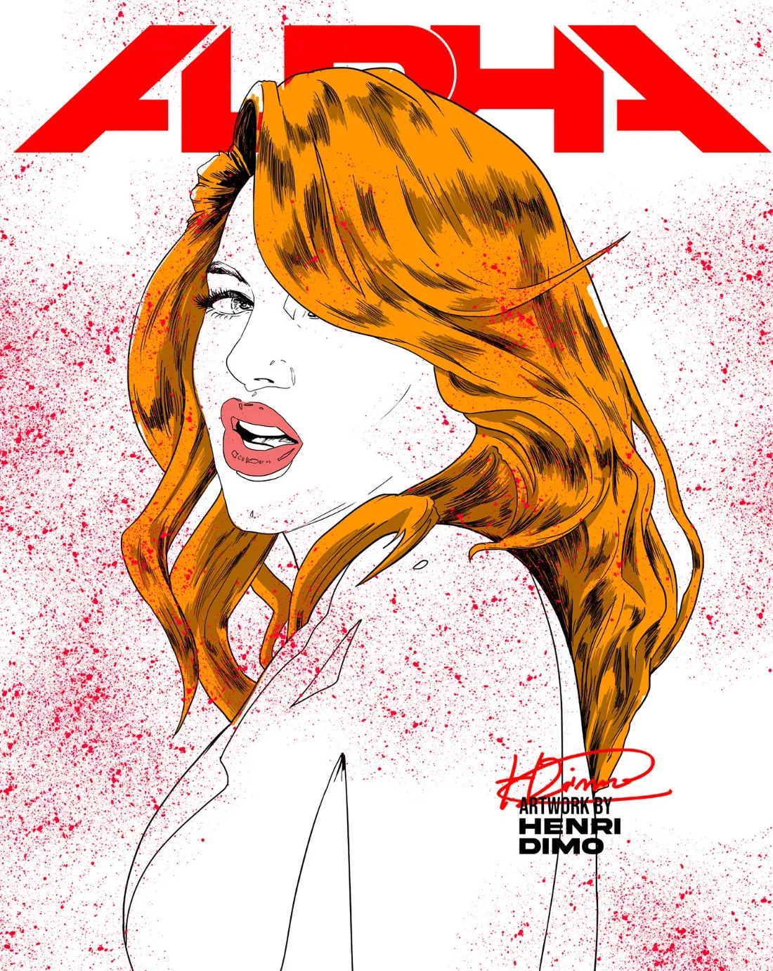

The reaction to those first additional artworks was extremely positive, and soon the request expanded: could the entire lineup be created this way? Then the list arrived. It was massive. Nearly 30 artists.
Somewhere between the first Noizy poster and that expanding list of names, the nature of the project had quietly changed. Alpha was no longer simply a concert built around one performer. It was becoming a gathering of artists, audiences and different musical cultures under one identity.
One of the final changes to the logo came directly from Noizy. He wanted the word SHOW added to Alpha so that the name would no longer remain abstract, but would immediately communicate the scale and character of the experience he was building.
A small typographic addition marked a much larger transformation. Alpha became Alpha Show.
04 — challenge
The design challenge
By this point, the challenge was no longer simply to create something visually striking. The challenge was to build a system capable of surviving growth.
How do you place almost thirty artists — Albanian stars, international guests, different genres, different visual identities and completely different audiences — inside the same graphic universe without erasing what makes each of them recognizable? How do you make every poster feel individual, while ensuring that when twenty or thirty of them appear together, they unmistakably belong to the same event?
How do you design an identity for an event that is still changing while you are designing it?
The lineup was alive. Artists were confirmed, others were added, some disappeared from the schedule, information changed and communications had to be continuously reorganized. The system couldn't depend on one perfect final composition because, for much of the process, there was no final composition. It had to behave almost like the festival itself — expanding, contracting and reorganizing without losing its identity.
The answer was to make Alpha Show the constant and the artists the variables. The red neon atmosphere, typography, logo, illustration treatment and compositional language became the connective tissue running through the campaign, while every artist was given a custom portrait and enough visual space to preserve their individuality.
Instead of forcing thirty personalities into one poster, I created one world large enough to contain thirty personalities.
05 — process
30 days of drawing

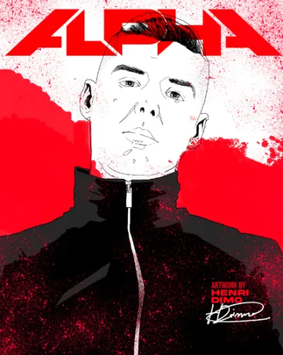

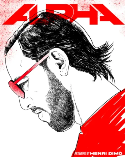

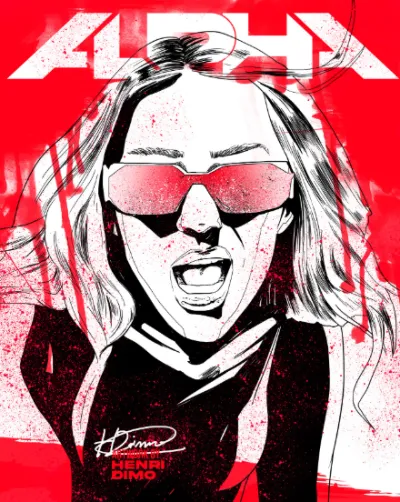


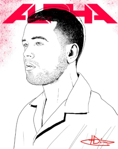
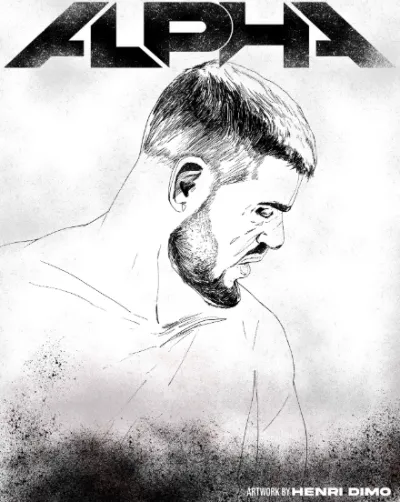



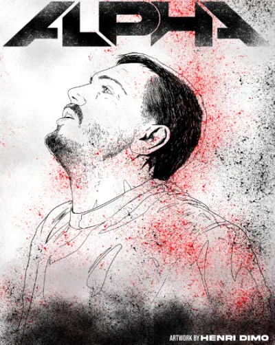


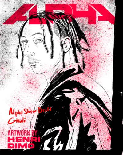

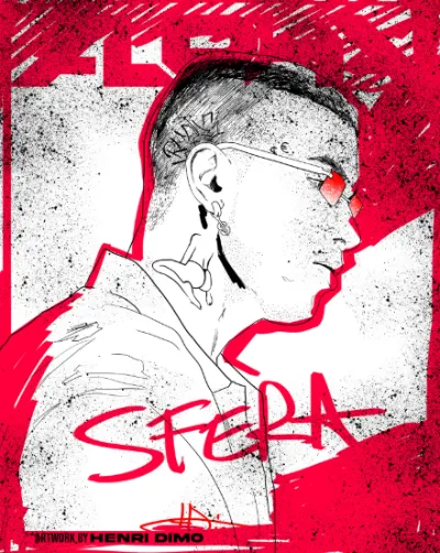

What followed was less a conventional design assignment and more a creative marathon. For roughly a month, almost every working day meant another Alpha Show artist. Draw. Refine. Compose. Export. Then another. And another.
Meanwhile, the lineup kept moving underneath the work. A new artist could appear and require another artwork; an existing composition could suddenly need to be revised; the hierarchy of names could change; promotional priorities shifted as the event approached. The campaign was being built while the thing it was supposed to represent was still taking shape.
There is a peculiar moment in large creative projects when design stops feeling like the creation of individual pieces and starts behaving like infrastructure. Alpha reached that point.
The posters were no longer isolated artworks. They were components of a visual machine that had to produce announcements, reveals, ticket communications, lineup combinations and promotional material without losing the original energy of that first red portrait.
06 — launch
The night Alpha went live

Around thirty days before the event, Noizy went live on Instagram. More than 80,000 people were reportedly watching as he announced that Alpha Show was coming to Tirana — a massive concert bringing together some of the biggest Albanian artists alongside international special guests.

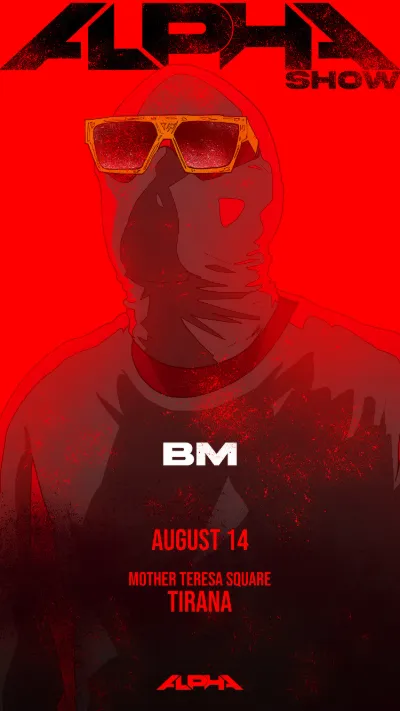
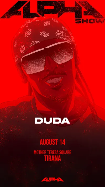


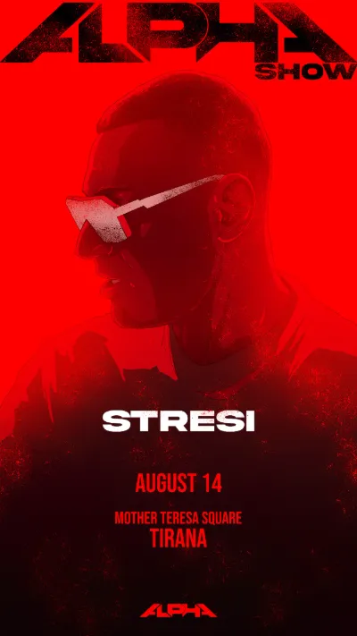

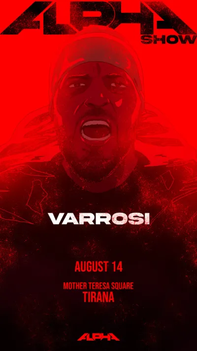


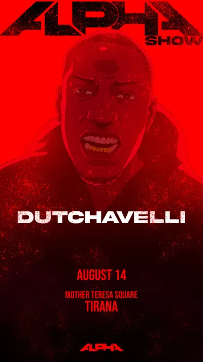


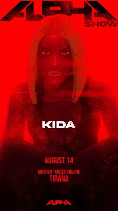


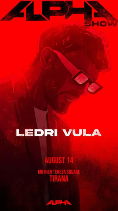
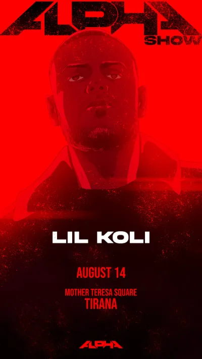


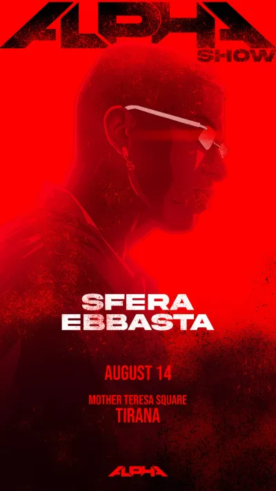
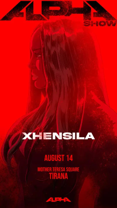


For weeks I had been looking at the event one artist at a time. That night, the audience saw the world at once.
Shortly after the announcement, Alpha Show was launched across social media and the complete lineup went live, with the individual artworks finally assembling into the larger visual system they had been designed to create.
It was one of those rare moments in commercial design when the work suddenly leaves the quiet, controlled environment in which it was made and becomes public almost instantaneously — appearing on thousands of screens, being shared, reposted and discussed by people who know nothing about the files, revisions, rejected versions or long nights sitting behind it. They only see the finished world. And that is exactly how it should be.

07 — the system
Beyond the poster
The launch wasn't the end of the project. In many ways, it was the moment when the identity actually had to prove that it worked.
A festival doesn't communicate through one beautiful key visual. It communicates through hundreds of smaller interactions: the moment someone discovers the lineup, the moment they decide which ticket to buy, the map they check before entering the venue, the banner they see on a platform, the announcement telling them that something has changed.

where the language went
Each one carried fragments of the same red world established at the beginning.
What had started as an image had become a system. What had started as a system had become an environment. And what had started as a concert had become Alpha Show.
08 — impact
The impact
The most meaningful result of the project wasn't simply the number of posters produced or the amount of communication material created around them. It was that the identity survived the scale.
The same visual idea that had worked when there was only Noizy on the poster remained recognizable when there were Ghali and Loredana, when the lineup expanded toward thirty artists, when individual portraits were assembled together, and when the campaign moved from announcement artwork into the practical communication ecosystem of a major live event.
The illustrations also gave Alpha something that conventional artist photography would have struggled to provide: ownership of its own imagery. Every artist entered Alpha through an artwork created specifically for Alpha. The campaign therefore wasn't borrowing the visual identities of thirty performers and attempting to hold them together with a logo; it was translating thirty performers into the visual language of one event. That distinction became the heart of the project.
the alpha show brandbook — drag or click a page edge to turn
Alpha Show would ultimately grow beyond that first campaign and establish itself as a recurring large-scale event, but for me its most interesting story remains hidden slightly earlier — in the period before the audience arrived, before the stage lights turned on and before thousands of people filled the venue. It is the story of watching the scale of a project change through design.
I began by drawing a logo for something called Alpha. Then I created a poster. The poster became a visual language. The visual language had to absorb three artists, then ten, then almost thirty. The concert became a festival.
And somewhere during thirty consecutive days of drawing faces illuminated by the same impossible red light, Alpha became Alpha Show.
See the full identity, posters and campaign.
alpha show — project